Bubblicious: Make it licious
Spec campaign | Art direction and copy: Zachary Zulauf
Spec campaign | Art direction and copy: Zachary Zulauf
The brief: Make Bubblicious relevant again for a generation that grew up with it and stopped buying it.
The insight: Gum doesn’t come with a special occasion. You chew it on the bus, in the library, stuck in traffic, during the most ordinary parts of the day. It’s the one small treat in a moment with nothing else going for it.
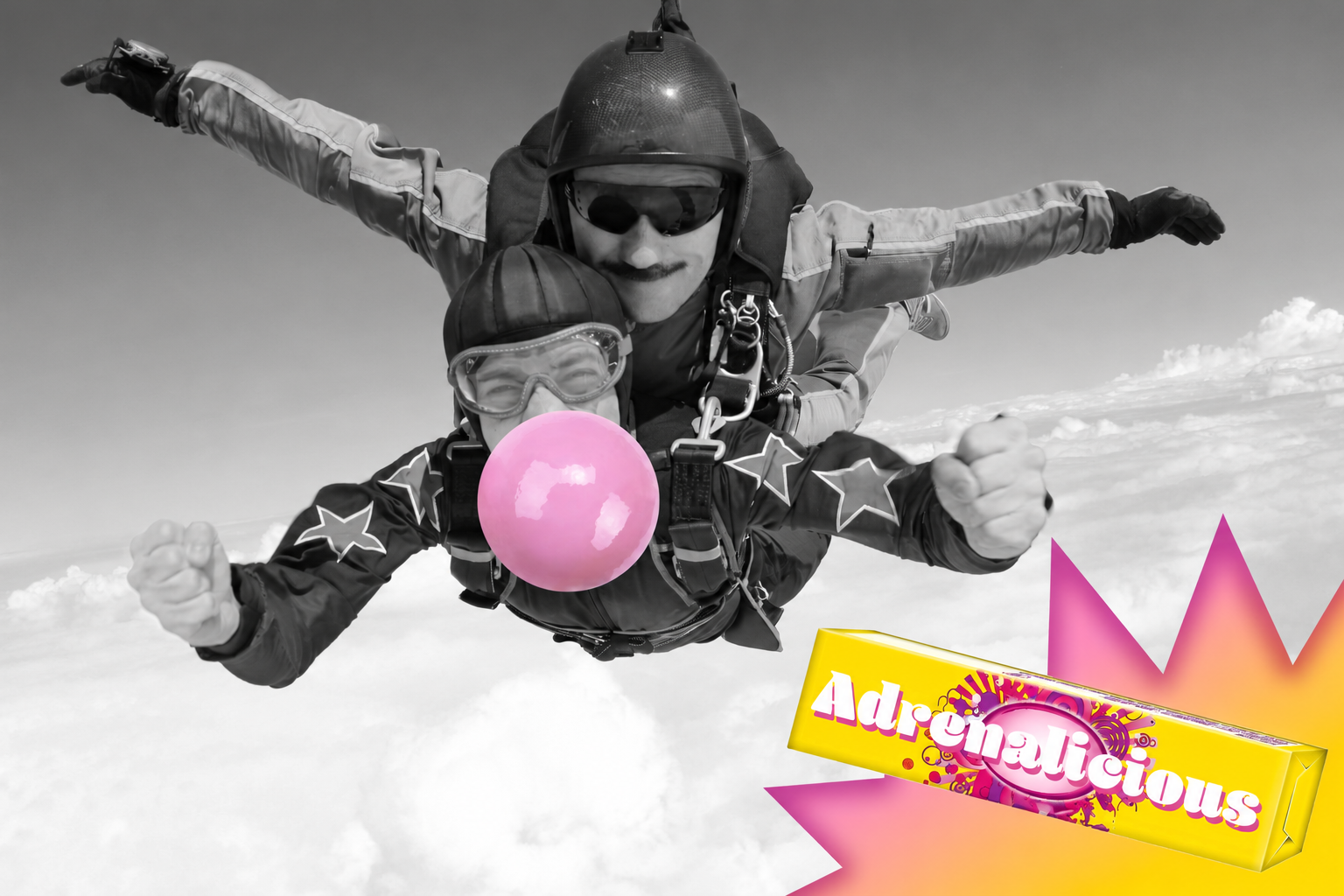
The idea: Take the brand name and put the suffix on whatever moment it’s improving. Commutelicious. Studylicious. Trafficlicious. Each pack is renamed for the scene. The photos are in black and white, and the only color in the frame is a big pink bubble and the yellow pack exploding out of the corner, so you can see the brand making a dull moment fun. Then Adrenalicious breaks the pattern: a tandem skydive in full color, with the bubble still going strong. It pays off the system. The gum doesn’t only save boring moments, it makes good ones better too.
The format works anywhere there’s a moment to name, so it can run as OOH, social, or a whole wall of packaging variants.